4D Time Magazine (Crown Act) Case Study
Previous
Next
(4D Time Magazine) Target Persona
(Design Companies, Owners of Small Design Firms, Big Name Brands)
Problem Space
- Able to communicate messages well through Visuals and Type
- Creates Iconic looking artwork (can utilize vibrant colors)
- Well thought out and constructed concepts in the early design stages
Affordances/Limitations
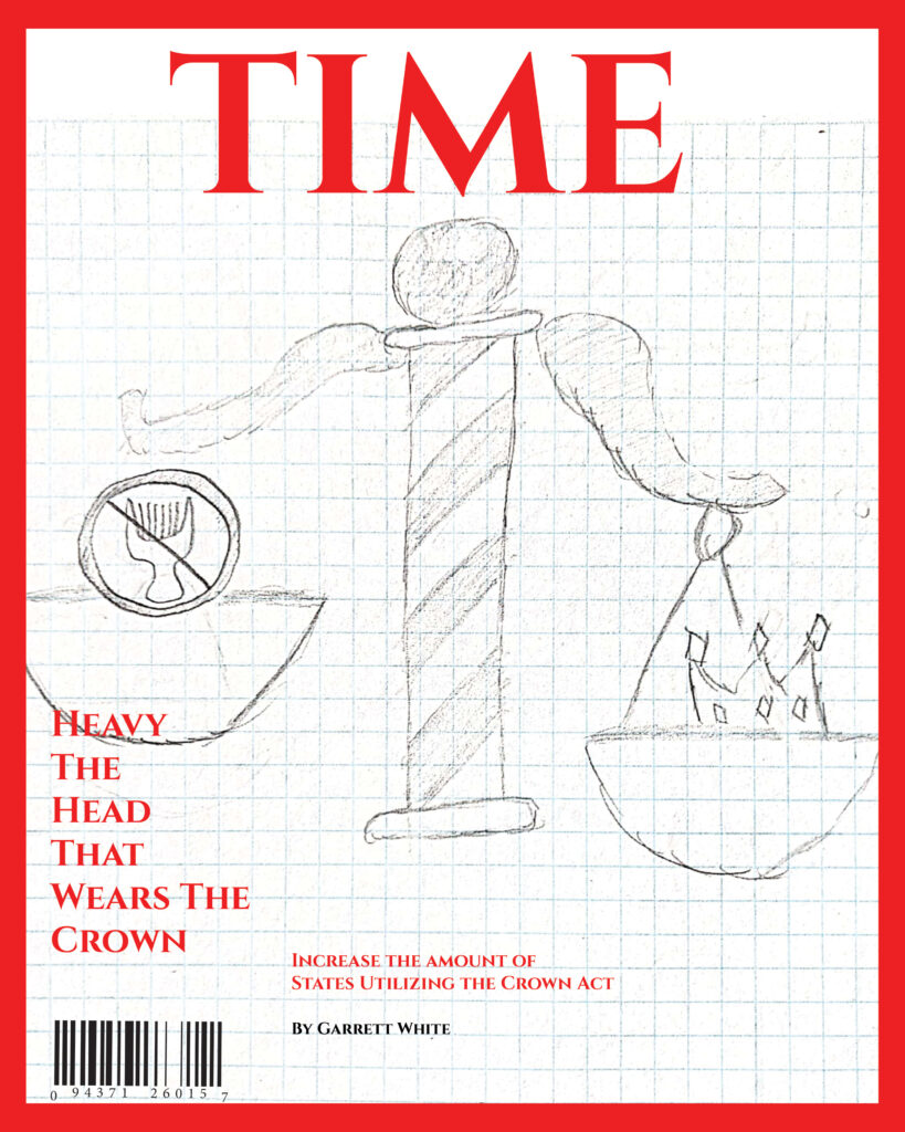
+ Cover signifies a Safe space for all with natural hair textures and types
+ Provides an icon resembling natural hair texture and the judicial process of the crown act
– Items used to resemble Natural Hair (Needs to be an iconic tool used for hair management)
– Has to be combined with an element resembling Act/Bill passing
(Case Study Solution)
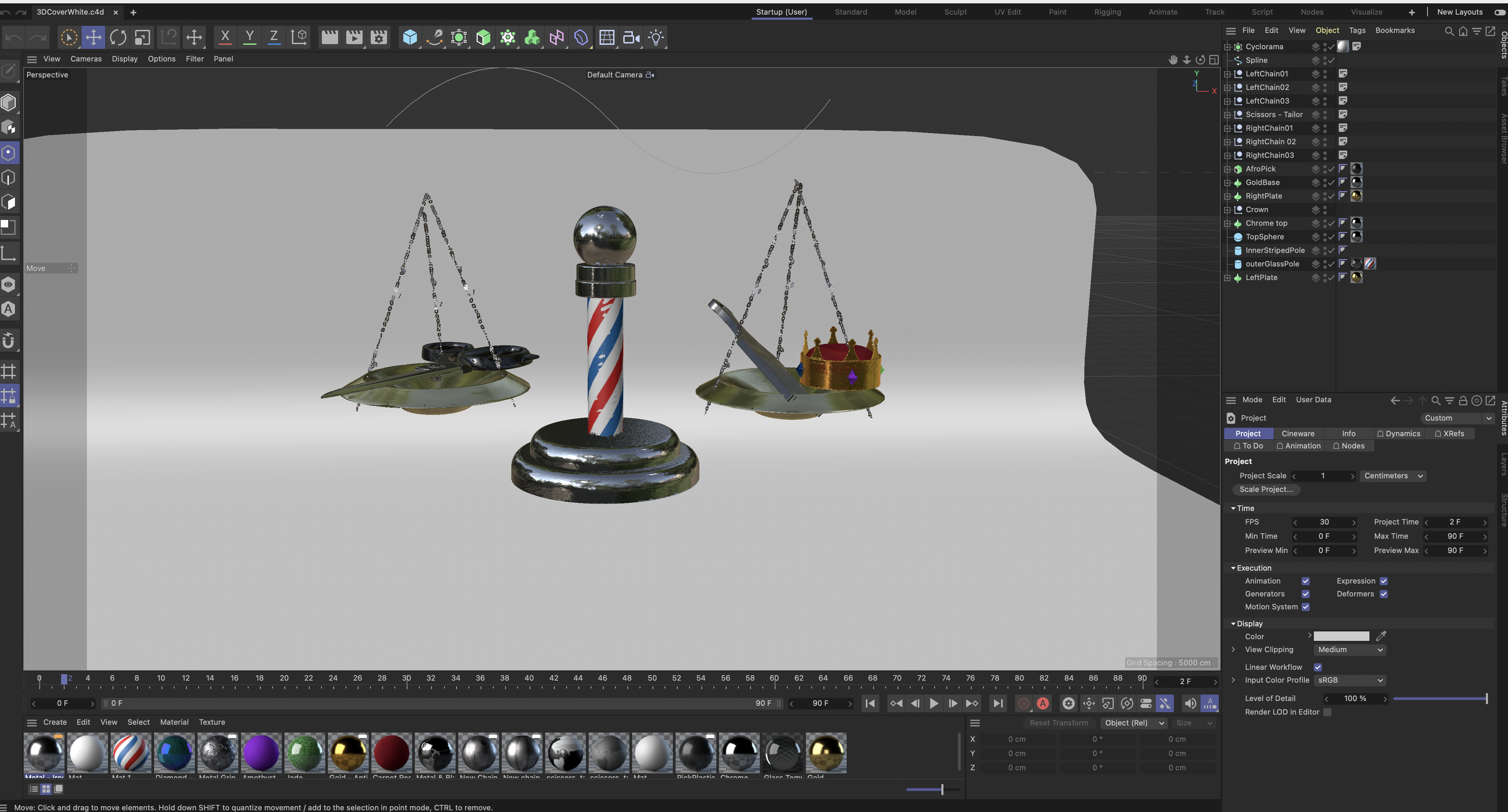
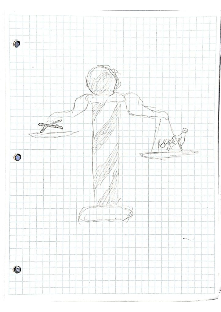
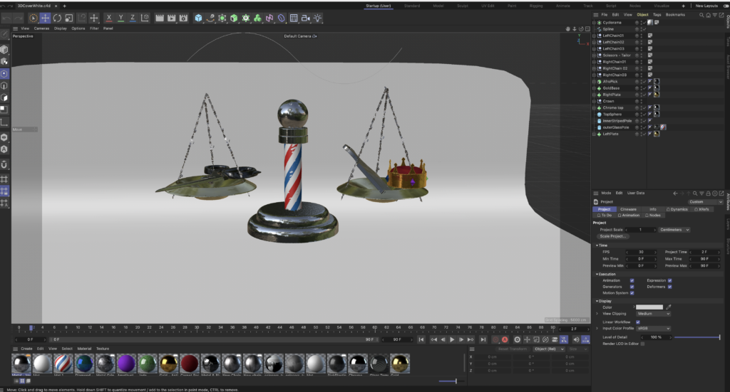
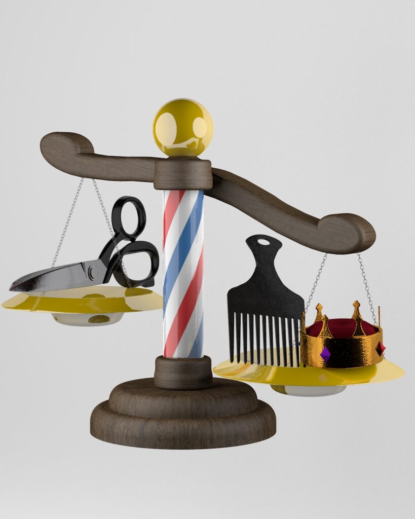
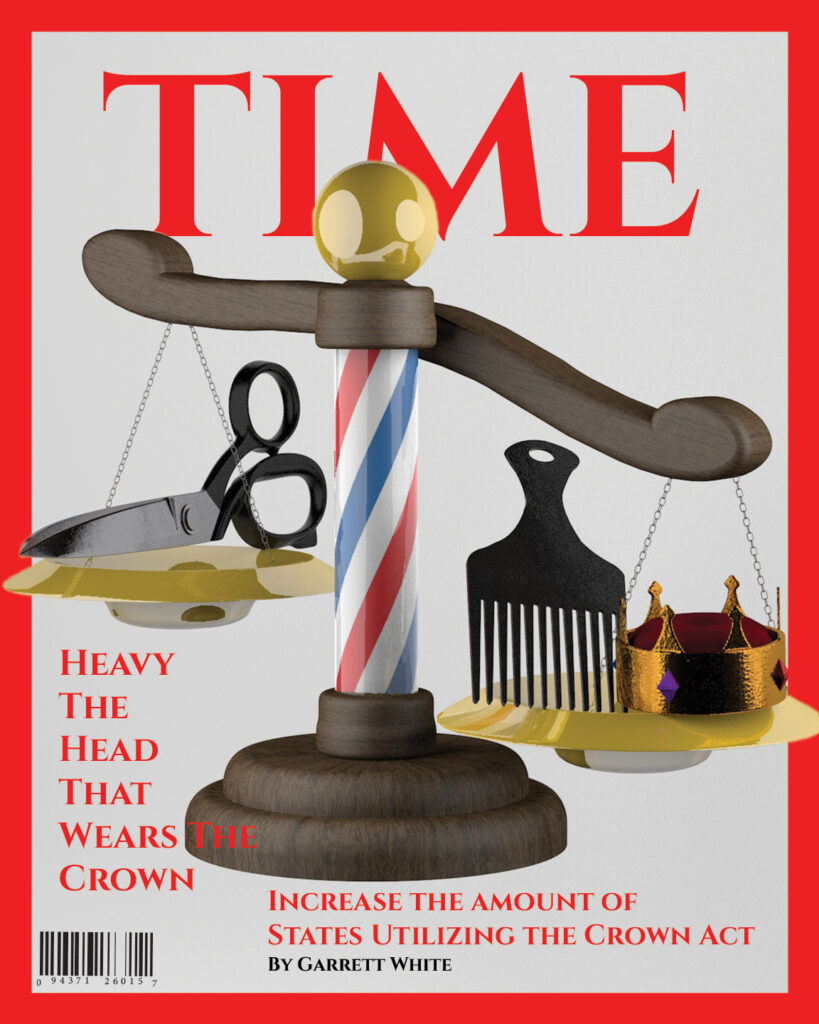
By utilizing Cinema 4D’s primitives, and crating base forms for some elements in Adobe Illustrator and bringing them into the software, I was able to create the exact shapes I needed to form my piece. Cinema 4D also provided an option to fit my shapes with “materials”. These materials are used for giving certain colors and textures to your nodes in order to make them look realistic. The types of materials I used was a wooden pattern for the arms and base of the scale, a dark grainy plastic for the afro pick, a gold for the crown, metal for the scissors and chains, and a striped pattern for the scale’s pole. A challenging factor when creating this project was set up. If one side was in shot more than the other, some elements were going to seem off scale and out of proportion. So in order to fix the problem, I set the camera to a perfect spot on the canvas where every spect of my work get’s enough treatment and can be of view for the audience. When the project was completed it was then time to render out the remaining nodes. The total render time was 5 minutes and depending on any further changes an additional 30 seconds. For the magazine cover portion of the assignment I chose Time to sponsor my project, as this would be an issue I believe they would tackle in one of their articles. The classic Time red and font was a must for the assignment. It wasn’t originally however as I wanted the background to be a mossy light green instead of darkish white. However with critiques from other designers we established that the darker white was the more effective solution to bring out the type’s color and make it not look fuzzy from a distance like the last hue choice. Then for an additional 3D look, I decided to mask out the areas in which the red border was covering the jpg of the scale and items. This would then overlap the border signifying the product and making it stick out more beneficially. For more graphic artworks like this check out my homepage, or my works at GWhite Designs.com